Coaching company branding
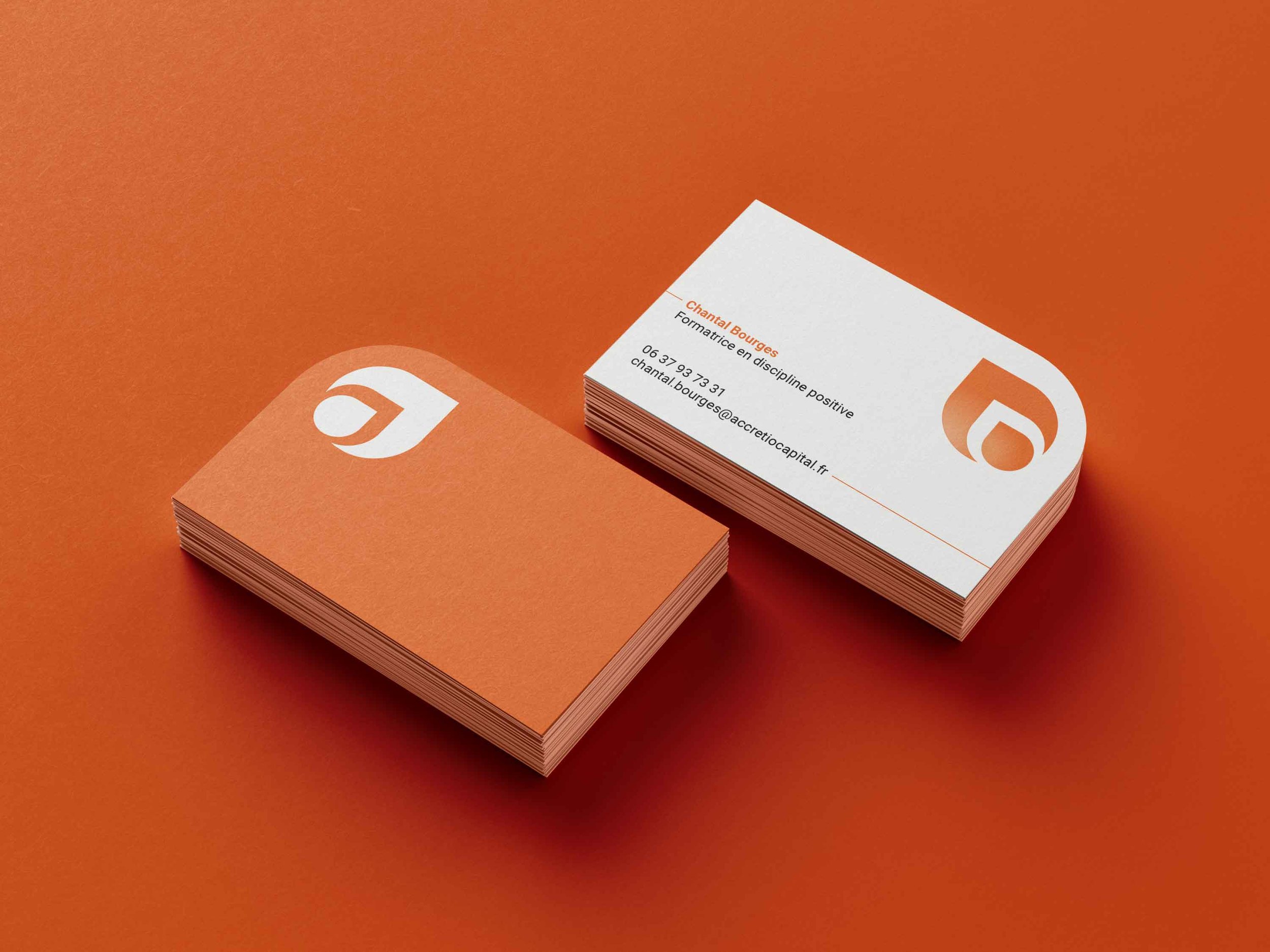
the project was to imagine a logo for a coaching company run by Chantal bourges. the idea was to picture a growing seed represented by 2 distinct shapes: the little one on the left becoming the bigger one. also i included the idea of the letter “a” as in “accretio” wich means “development” in latin. finally the general movement is pointing up right to implies the idea of a personal growth, heading towards a brighter and more positive future.